Knowing that I would have to produce a body of practical work along side my essay, I made sure from the start that I had chosen a topic that would genuinely interest me as this would make engaging with the module a lot easier and more enjoyable. To do this I brainstormed the areas of design I a interested in as well as some general topics that interest me outside of Graphic Design. One topic that stood out for me was culture, by this I mean the differing design cultures around the world such as Japanese and European. Once I had chosen this as an area of investigation, the next task was to then come up with a sort of 'thread' that I could use as an example that runs through a number of different design cultures. At first I had the idea to chose an international brand such as clothing or produce, but through further research I came across the idea to look at the Olympic Games. This topic suited my aims perfectly and allowed me to explore different design cultures existing throughout the 1900s. To then turn this topic into a discussion I began to look into the appropriateness of each individual branding campaign of the modern day Olympic Games. This decision was informed by that fact that one major issue with designing for an international audience is it being received differently by people of different beliefs and cultures and so this issue is demonstrated clearly using examples of Olympic branding. Through extensive research and a genuine interest in the topic, I was very pleased with the final draft and is a definite improvement from my CoP investigation last year. This is due to the amount of research and readings I undertook before starting the essay. This meant that I had a good understanding of relevant topics and issues and made writing the essay easier and more informed.
As the essay focused on branding and identity of the Modern Day Olympic Games, it was an easy decision for me to choose to produce my own Olympic branding as a practical response. Once I had chosen an Olympic event to brand, the next step was to further link it to the essay by focusing on the appropriateness of my own designs. I first started to design posters that would ideally be seen as an appropriate means to advertise the host nations culture through design. However due to feedback, although the designs themselves were appropriate, the issue with them was with practicality. In response to this, I then shifted the focus onto how I could apply the campaign in a more appropriate way. Evaluating the practical side of the project, I think that I achieved what I set out to do how ever there were some set backs that could have been avoided from the start. Taking on the branding of an Olympic Games is a huge task and so from the start I knew I couldn't produce a whole campaign in the time I had. This means that although I am happy with everything produced, I have only covered a few aspects of a full campaign and so feels half finished. In the future, I will make sure that if I am undertaking something as big as this that I make sure to make my aims more specific and to focus on only a few aspects as apposed to the whole thing.
I will definitely be further exploring design cultures around the world for my CoP 3 investigations over the summer and into final year as it is something I am genuinely interested in and can see myself producing even stronger work next year. I will make sure I chose a suitable topic to write about and then learn from mistakes made this year during my practical and improve on them.
Showing posts with label Studio Brief 02. Show all posts
Showing posts with label Studio Brief 02. Show all posts
Monday, 24 April 2017
Wednesday, 19 April 2017
Olympic Cigarettes
Inappropriate Olympic branding
 "The tension between the Olympic values and commercial interests is long standing. One of the most successful licensed Olympic products ever produced, for example, was “Olympias”, a brand of cigarette. Produced from a mixture of Turkish and Greek tobacco, it was designed to generate funds to support the organization of the 1964 Olympic Games in Tokyo. Olympias generated over $1 million in revenues for the Organizing Committee."


 Similarly with the Nazi Olympic Games 1936, olympic cards were released within packs of cigarettes and sold all over Germany. Thus promoting the use of cigarettes and inappropriately building a bridge between smoking and the Olympic Games.

Generally, the olympic games is thought of as a celebration of life, health and sport and yet one of the most successful product promotions related to the games is cigarettes. The Olympic Games, including the logo and its five interlocking rings, have been one of the powerful brands in the history of marketing. After all, what company or organisation would not want to be affiliated with words like world peace, excellence, doing your best, camaraderie, teamwork, fair play. But it really wasn’t until the 1980s when the International Olympic Committee began taking control of its brand. Michael Payne wrote how cigarettes, game shows and hygiene products for example were being marketed via the Olympic brand, which created tension in the IOC as it was felt such products did not appropriately represent Olympic values. One of the more remarkable examples Payne cites is from the 1964 Tokyo Olympics...
 "The tension between the Olympic values and commercial interests is long standing. One of the most successful licensed Olympic products ever produced, for example, was “Olympias”, a brand of cigarette. Produced from a mixture of Turkish and Greek tobacco, it was designed to generate funds to support the organization of the 1964 Olympic Games in Tokyo. Olympias generated over $1 million in revenues for the Organizing Committee."
Payne went on to provide another example in 1964, a clever promotion using the Olympic brand to further increase the spread of cigarette consumption.
"The marriage between cigarettes and the Olympics was a popular promotional theme at the 1964 Games. A popular Japanese cigarette brand, “Peace”, ran a promotion where each package was sold with a numbered premium ticket. This entitled anyone drawing a winning ticket to claim a prize of a further 365 packs. Even back in the 1960s, marketers realized that the Olympic rings could draw consumers’ attention to a product. Every packet of “Peace” cigarettes, carried the Olympic emblem."

Below is a chart showing smoking prevalence among Japanese men and women. Look at the mid 1960s and you can see leaps in consumption between 1963 and 1965. In fact, it appears that smoking reached its highest rates, almost Olympian heights, around those times. And now the Japanese are paying for it as mortality rates due to lung cancer have peaked in the past 20 years. Fortunately, smoking consumption among women has stayed flat over the decades, and thus so has their risk to lung cancer.
 Similarly with the Nazi Olympic Games 1936, olympic cards were released within packs of cigarettes and sold all over Germany. Thus promoting the use of cigarettes and inappropriately building a bridge between smoking and the Olympic Games.
CoP Practical Research
Appropriation of Design
Appropriation within design has 2 meanings, both are relevant to designers and both need careful consideration...
These meanings are:
1. the use of pre-existing objects/images within design or art with 'marginal amounts of transformation applies to them'. This act also adds new context to existing work.
2. The use of a product by its users in a way not intended by the designer.
Definition 1 explained...
The appropriation of pre-existing objects and images has been used extensively in modern art and design. Pablo Picasso used objects which were not previously art, such as newspaper clippings. These works placed the objects in new contexts without transforming the original concept.

Marcel Duchamp took the process further with his concept of “ready-made” which used objects produced by industry for ordinary use and transposed them into art through the use of “presentation and selection”. This wasn’t without controversy and one of his most famous works – a urinal placed on a pedestal was rejected by an exhibition panel because it was considered plagiarism.
Andy Warhol took the Campbell’s Soup images to create some of his most famous works...

Photographers, fashion designers, installation artists, etc. have all used appropriation of this kind and in more recent years so have web designers.
This form of appropriation is not without its risks...
Copyright
There are real concerns regarding the copyright of work when it is appropriated. Andy Warhol, for example, who was one of the most famous artistic appropriators found himself on the receiving end of much litigation with respect to his appropriations. He lost a case when photographers objected to silk screen reproductions of their work produced by Warhol but won a case against Campbell’s Soup despite having clearly reproduced their image.
Cultural Appropriation
More recently, there have been concerns raised about “cultural appropriation” in which designs incorporate items from other cultures. While, this may seem innocuous on the surface – it often gives rise to allegations of racism if the handling of such material is not seen to be sensitive.
When Charles Caleb Colton said; “imitation is the sincerest form of flattery” he didn’t mean go ahead and appropriate someone else’s culture in the wrong way.
The star Beyonce has been accused of cultural appropriation by appearing in a Bollywood costume in a music video; some allege that she has been careless in her treatment of India’s cultural heritage.

J K Rowling, the Harry Potter author, has recently been drawn into allegations of cultural appropriation by her handling of North American indigenous culture in her “History of Magic”.
Also this year, the fashion brand H&M has found itself criticised for cultural appropriation of Jewish prayer scarves in a scarf sold by the company.

The key to avoiding cultural appropriation seems to be straightforward; ask members of the community you are appropriating from if they find it offensive or not. However, it is probably worth noting that in today’s ever-connected world – there’s always someone looking to take offence no matter your intentions. Cultural appropriation should be best handled sensitively at all times.

I found a powerpoint presentation that further explained appropriation. This presentation highlighted the differences between appropriation in art & design.

Art - Appropriation is over
Design - Appropriation is covert


e.g. these two examples above. The Andy Warhol on the left is overtly referring to the campbell's soup can design. Whereas the propaganda poster on the right is references a poster design that may not be recognised by some of its viewers.

Homage:
"special honour or respect shown publicly"
Tuesday, 7 March 2017
Rebranding Tokyo 2020
Anime Olympic Campaign
The first idea that I have taken forward is to produce an advertisement campaign for the Tokyo 2020 Olympic Games aimed at the younger audiences of the event. To target this audience, I have used imagery from the very popular and renowned anime culture of Japan. Generally speaking, Anime is enjoyed by people of all ages around Japan however on a more global scale, it is enjoyed more by the younger demographic.
Below I have found a couple of surveys that represent peoples opinion on what age bracket watches anime cartoons most. The top survey interestingly shows that people think more people between the ages of 18-25 watch it as opposed to the 12-17 bracket. Even so, the younger age bracket is still strongly represented. The survey below that shows that people think the 13-17 age bracket watch anime more often opposed to 18+.


Minimal Olympic Branding
 Informed by the research for my essay, I have taken forward a second idea for rebranding the Tokyo 2020 olympics. The second idea is to create a campaign that, when seen, viewers will recognise that the event is held in Japan almost instantaneously. This idea stemmed from my research into the Tokyo 1964 olympic poster design shown here on the right.
The minimal and clean design of the official poster is unrecognisable as anything else other than Japanese design. The poster consisting of a single large red circle as the focal point with a slight gradient on top of the olympic logo and type in gold. The overall design is only made up of 3 simple components and yet is undeniably one of the most iconic olympic poster designs.
This poster has inspired me to produce a similar campaign for the 2020 olympics and bring this typically Japanese style into the 21st century. The previous idea has a target audience of younger demographics, however this idea will appeal on the intended global scale of any olympic event. My essay touched on the appropriateness of olympic branding and the successfulness of catering for such a global audience. My designs will also consider this as it is a project that will be seen by all cultures around the world. I will be taking influences from Japanese design including Japanese poster art and other examples of minimal design.
Existing Poster Designs


Rick Hinck's minimal poster designs for the World Cup's best goals
For the World cup, Rick Hinck recreated the best moments form world cup history through clever minimal design. Using mainly dots and thin lines, he has managed to recreate iconic moments from the event. Although there is little detail or imagery, it is immediately clear what the posters represent. As these posters were designed for a sporting event, they are a great source of influence for my own work.
Giro d'italia poster design


similar to the world cup posters, these designs were made for the famous Italian bicycle race held each year. Again, these posters are made up of only a few components and yet the intended message is certainly put across. The key component for me is the illustration of the country itself. As such a recognisable shape, this gives the reader an immediate idea of where and what the poster is advertising as the eyes are then drawn to the large cyclist.
 As well as sports posters, I also had a look at minimal poster design from else where.

 Similar to the poster design for the Tokyo 1964 olympics, this poster plays on typical Japanese design and composition translating the Japanese red circle into more of an ambiguous shape with characters written horizontally underneath.
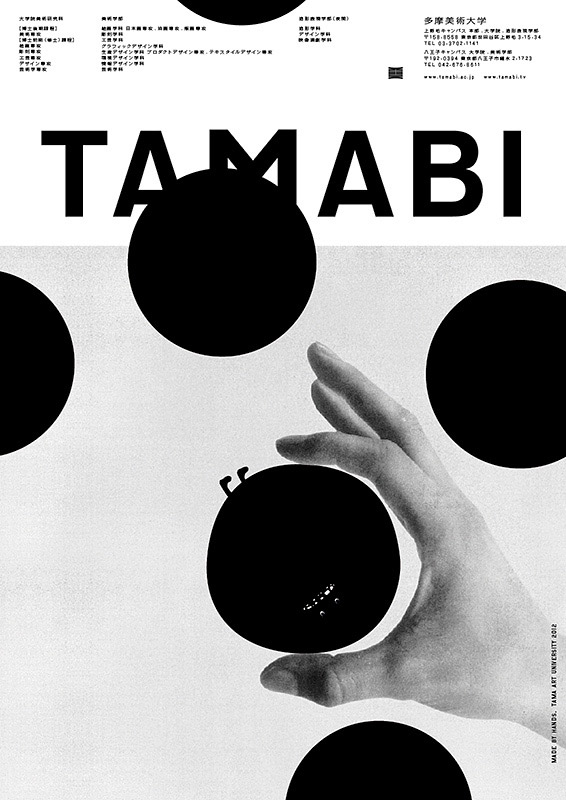
 The simplicity of this design lies in the large black circles that partially cover the design including the title. The colour palette is limited to black, white and greys.

Taking influence from these successful examples of minimal sports posters, I will produce some of my own for Tokyo 2020.
Design Production
 Above are my final resolutions for an idea on event posters. I chose to produce posters specific to some of the olympic sports using a minimal approach inspired by Japanese design and minimal sports posters. The posters would be used to signify when or where certain sporting events are held around the olympic park.
To take this idea further, I will be designing banners, flags and bus stop adverts as this is included in any olynpic branding project.
The first idea that I have taken forward is to produce an advertisement campaign for the Tokyo 2020 Olympic Games aimed at the younger audiences of the event. To target this audience, I have used imagery from the very popular and renowned anime culture of Japan. Generally speaking, Anime is enjoyed by people of all ages around Japan however on a more global scale, it is enjoyed more by the younger demographic.
Below I have found a couple of surveys that represent peoples opinion on what age bracket watches anime cartoons most. The top survey interestingly shows that people think more people between the ages of 18-25 watch it as opposed to the 12-17 bracket. Even so, the younger age bracket is still strongly represented. The survey below that shows that people think the 13-17 age bracket watch anime more often opposed to 18+.

These surveys inspired me to produce my own survey. I shared the survey on Facebook to get a range of different ages answering. The results below support my previous findings and confirm that, in this country, Anime is thought of as a younger persons preference.

Design Production
I have produced a series of posters that combine stock images of previous olympic games with typical anime scenery and imagery. The idea being to compare Olympic athletes with anime characters or superheroes. The intended effect is to glorify them and to encourage young people to admire and look up to the athletes like they would their favourite super heroes.
These images would be used on large billboards to achieve the intended effect.


Show campaign in different places eg bus stops, flags etc
Minimal Olympic Branding
 Informed by the research for my essay, I have taken forward a second idea for rebranding the Tokyo 2020 olympics. The second idea is to create a campaign that, when seen, viewers will recognise that the event is held in Japan almost instantaneously. This idea stemmed from my research into the Tokyo 1964 olympic poster design shown here on the right.
The minimal and clean design of the official poster is unrecognisable as anything else other than Japanese design. The poster consisting of a single large red circle as the focal point with a slight gradient on top of the olympic logo and type in gold. The overall design is only made up of 3 simple components and yet is undeniably one of the most iconic olympic poster designs.
This poster has inspired me to produce a similar campaign for the 2020 olympics and bring this typically Japanese style into the 21st century. The previous idea has a target audience of younger demographics, however this idea will appeal on the intended global scale of any olympic event. My essay touched on the appropriateness of olympic branding and the successfulness of catering for such a global audience. My designs will also consider this as it is a project that will be seen by all cultures around the world. I will be taking influences from Japanese design including Japanese poster art and other examples of minimal design.
Existing Poster Designs


Rick Hinck's minimal poster designs for the World Cup's best goals
For the World cup, Rick Hinck recreated the best moments form world cup history through clever minimal design. Using mainly dots and thin lines, he has managed to recreate iconic moments from the event. Although there is little detail or imagery, it is immediately clear what the posters represent. As these posters were designed for a sporting event, they are a great source of influence for my own work.
Giro d'italia poster design


similar to the world cup posters, these designs were made for the famous Italian bicycle race held each year. Again, these posters are made up of only a few components and yet the intended message is certainly put across. The key component for me is the illustration of the country itself. As such a recognisable shape, this gives the reader an immediate idea of where and what the poster is advertising as the eyes are then drawn to the large cyclist.


Taking influence from these successful examples of minimal sports posters, I will produce some of my own for Tokyo 2020.
Design Production

To take this idea further, I will be designing banners, flags and bus stop adverts as this is included in any olynpic branding project.
Monday, 20 February 2017
Pitching my Idea
Anime poster series
The idea I have chosen to take forward, informed by feedback, is to produce a series of posters for the Tokyo 2020 Olympic games. These posters will include the popular anime culture that Japan is known so well for. The idea to use this was informed by an article I found that stated the branding may include anime characters such as Goku from a popular anime series as an ambassador for the games. This decision was made in order to appeal to a younger target audience.
Anime culture is not only popular with children, but people of all ages in Japan enjoy it and it is even used regularly in advertising and branding.
Idea 01

The first idea was to use popular Japanese anime characters within a series of poster designs. The characters would be performing various olympic sports.
However, a weakness to this response is that it would be extremely difficult to either find anime characters that I can manipulate or to draw the characters in the desired positions.
Another weakness is that the characters would not be widely recognised around the world. Olympic branding is designed for a global audience and so these posters need to appeal to as many different people and cultures as possible.
Idea 02

Developing on from idea 01, with the help of a group of peers, I came up with an alternative approach that would have a similar effect. The second idea is to use high resolution pictures of world famous olympic athletes, such as Mo Farah and Usain Bolt, and add anime style details to the images. The result would be a series of posters that glorified the athletes and make them look like heroes and heroins. These posters would appeal strongly to a young target audience as they would look up to the athletes in admiration and thus promoting more kids to get involved with sports.
As well as appealing to the population of Japan, it would also appeal to the younger generations all over the world, making it a suitable campaign for the Olympics.
This campaign would not be the main identity of the games, it would simply be a side project aimed at the young population around the world. If it were the main branding, I think it wouldn't work as well for older generations all over the world and might look a bit childish.
Tuesday, 7 February 2017
Practical Investigation Development
Tokyo 2020 Olympic Games Rebrand
For my practical investigation I have decided to rebrand the Tokyo 2020 Olympic games informed by my research into branding and identity of the modern games throughout my essay.
My essay focused primarily on the importance along with the appropriateness of the branding for each of the games held from 1896 through to the late 1900s. I will be focusing on producing a rebrand informed by the most successful examples olympic branding in recent history. These examples will help me to produce a campaign that builds on the existing one and that portrays the right message that would be well received by its large audience.
The target audience is something that heavily informs every project I have come across so far and so this is something I intend to start with. After speaking with a tutor, the general opinion was that as the olympics is aimed at the world as a whole, it provides a daunting task for the designer. To tackle this, I will be choosing a sub category to aim my campaign at.
Through research into the existing branding and identity of the 2020 games, I found out that the committee decided on using well known anime characters to brand the games. This is because Japan famously has a large anime pop culture that is enjoyed by all ages around the country and is something the nation has been recognised for for years. Their other justification is that they aim to attract the younger generations to inspire them to get involved. This research has informed my decision to focus my own campaign at the younger demographics of both Japan and from around the world.
I thought that I would do some research into the existing branding as I plan on building on it, as opposed to starting from scratch.

Winning Logo Design
- chequered pattern been popular around the world
- in Japan, chequered pattern became known as ""ichimatsu moyo" in the Edo period (1603-1867)
- the indigo blue colour expresses a refined elegance and sophistication that exemplifies Japan
- Designer - Asao Tokolo
- "three different triangular shapes represent diversity"
Subscribe to:
Posts (Atom)